

WAWWA AW19 | Can’t See the Wood
This season’s campaign evokes the beauty of forests, nature and wildlife and acts as a pertinent reminder of what we are set to lose if we do not change our consumption habits.

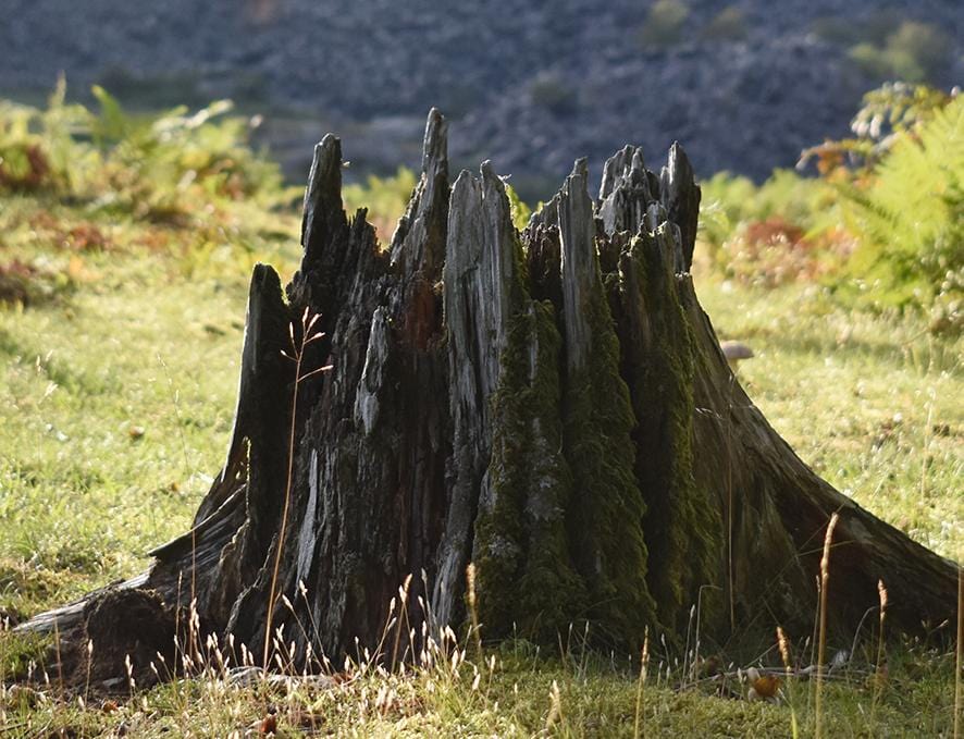
“Can’t see the wood for the trees” is a proverbial phrase that is equally applicable to modern society as it was when coined by John Heywood in 1564. It acts as a metaphor for situations in which we are so focused on the finer details that we lose sight of the bigger picture. In this sense we have applied it to our stance on the environmental disaster we are in the midst of. We are so consumed by insignificant contemporary issues (the likes on your latest Instagram post, the car you drive, Boris Johnson… the list goes on) that we lose sight of what really matters, the ENVIRONMENT. If we continue abusing the planet at the current rate, you’ll soon have no home from which to vent your frustration on these lesser evils as we’ll have no planet at all (scary but true).
One major cause for concern has been the dramatic rise in wildfires across the world in recent years. It was the Saddleworth Moors wildfire in 2018 that really hit home for us. A blaze that lasted 3 weeks, destroying 7 square miles of moorland, the smoke was clearly visible from our office 14 miles away. But this is not just a national issue, it is international. All you have to do is cast your mind back to the devastating effects of the forest fires in the Amazon a few weeks ago. Our AW19 collection has been designed in reaction to the destruction caused by such fires and the Can’t See The Wood name takes on both a literal and metaphorical meaning as a result. For if we continue to abuse the planet there won’t be much nature for us to see.
Out of the ugliness of these events, however, does come beauty in the form of the range we are excited to share with you (that sounds so cheesy now I read it back). The colour palette is warm and autumnal featuring blaze red, burnt yellow and ember orange, relating to the wildfires we have witnessed. These colours sit alongside black, ivory, sand and forest green that represent the natural beauty of untouched forests and landscapes (please see pictures attached if you don’t believe us).

These colours have been used for some wicked pieces. The Wildfire and Burnt Dip Dye Sweatshirts represent the fires that we want to draw attention to. The See The Wood tees and hoodies are all composed of 100% Organic cotton in a factory that runs on renewable energy. Our attention to detail knows no bounds, as the screen prints are also produced using water-based inks! Speaking of attention to detail, we noticed that the Jonah Rugby sweatshirt was pretty popular so we’re going to treat you to two new colourways (lucky you). It still features all the great details that made it a hit the first time around, such as the organic cotton jersey body, the organic cotton ripstop pocket and collar, Corozo nut buttons and a zip made from recycled plastic.

All of these pieces have obviously been designed with sustainability and the environment at the forefront. Not only have we made the production process as sustainable as possible, but it is also essential that they are consumed in a similar manner. Each garment is timeless in design, in the hope that you will still be wearing them in years to come. We don’t want to add the mounting burden the fashion industry is placing on the environment.
Take a look at the collection here. Be mindful of the environment. Start to ‘see the wood’.